Colours of Norway!
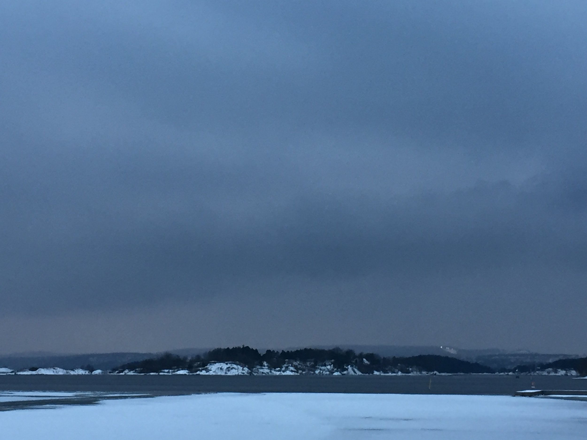
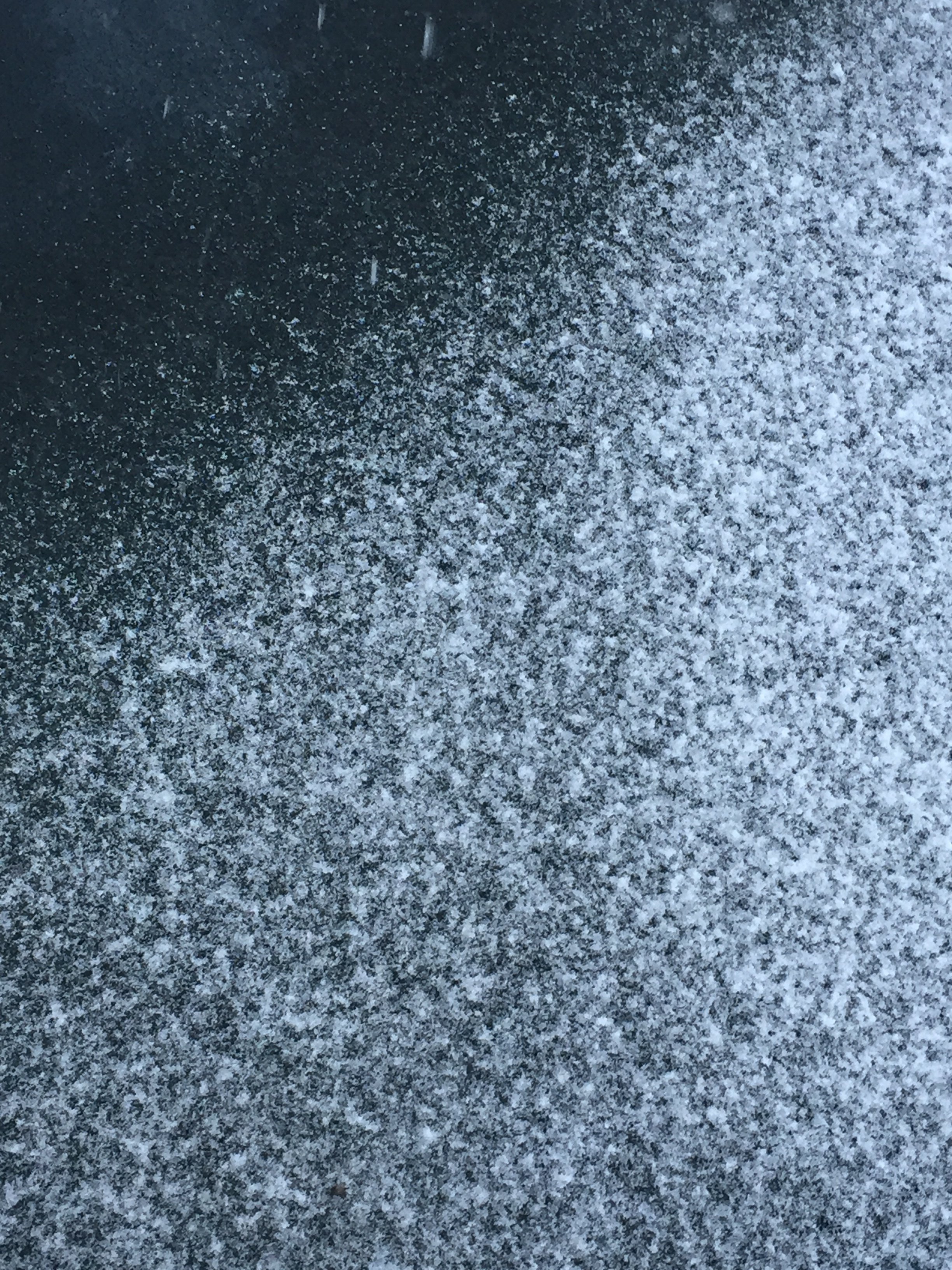
I came back from an amazing long weekend trip to Oslo! I feel so inspired! Something about winter and fresh falling snow make for spectacular colour inspiration.
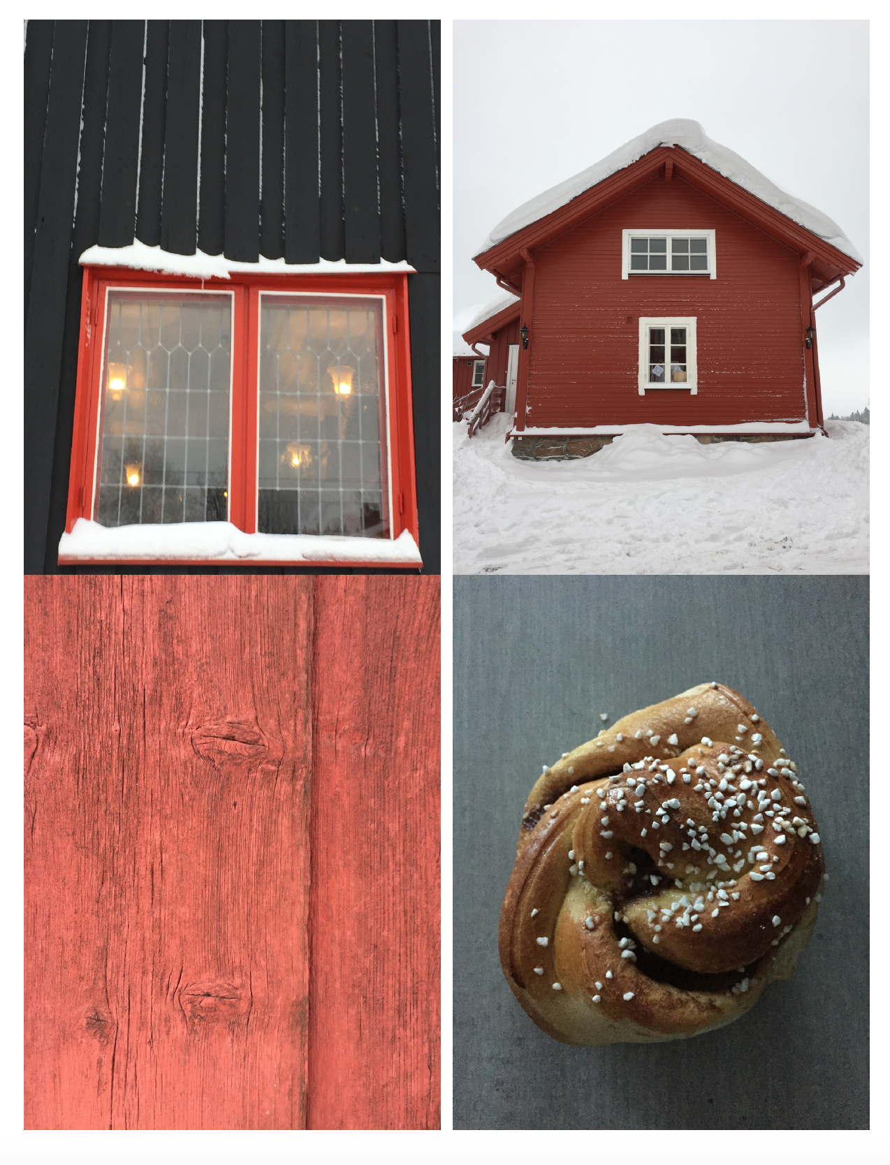
The red of Scandinavia ( or Norwegian Red) is beautiful but looks even better against an icy snow white, some charcoal black, a bit of blue grey and why not add a bit of golden yellow ochre of a kanelbolle, which are so delicious!
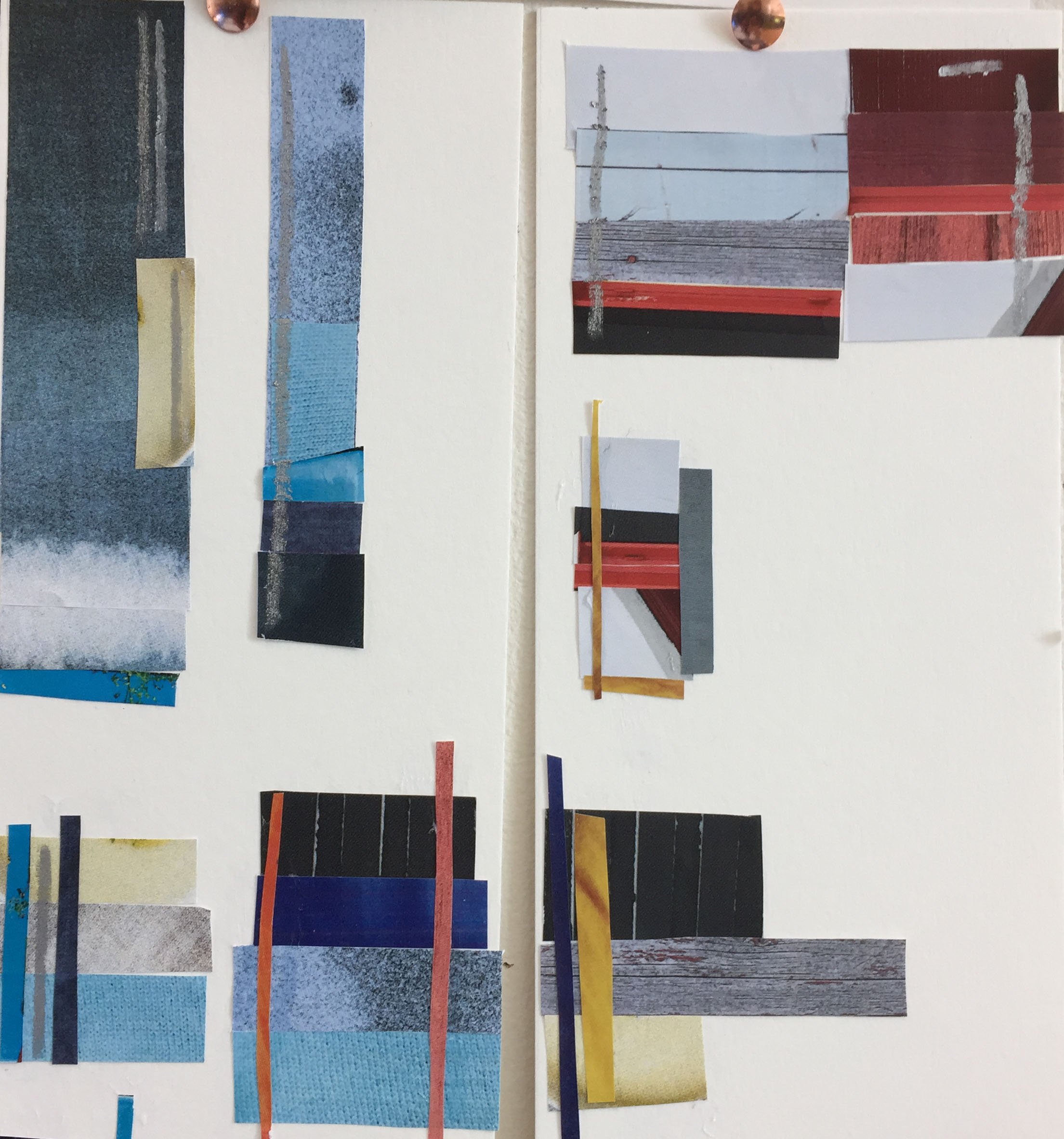
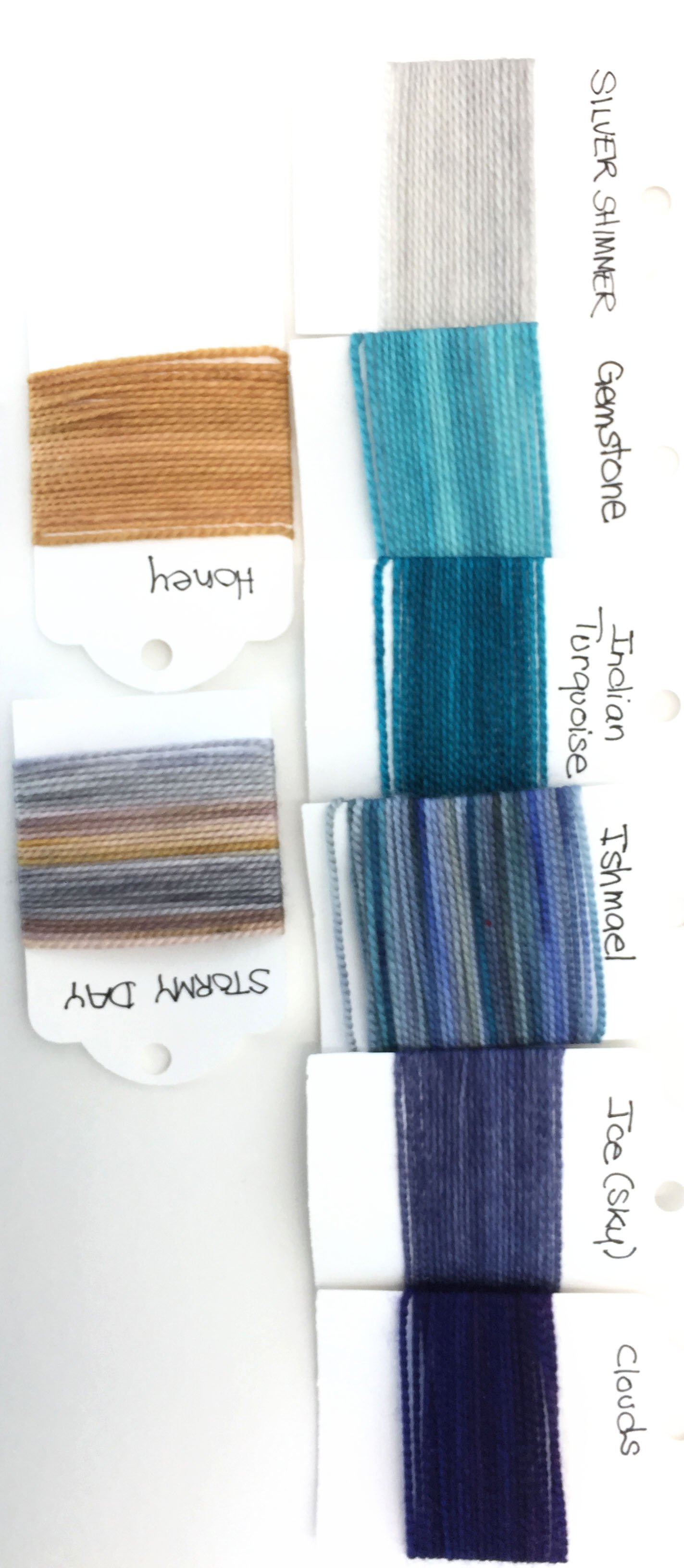
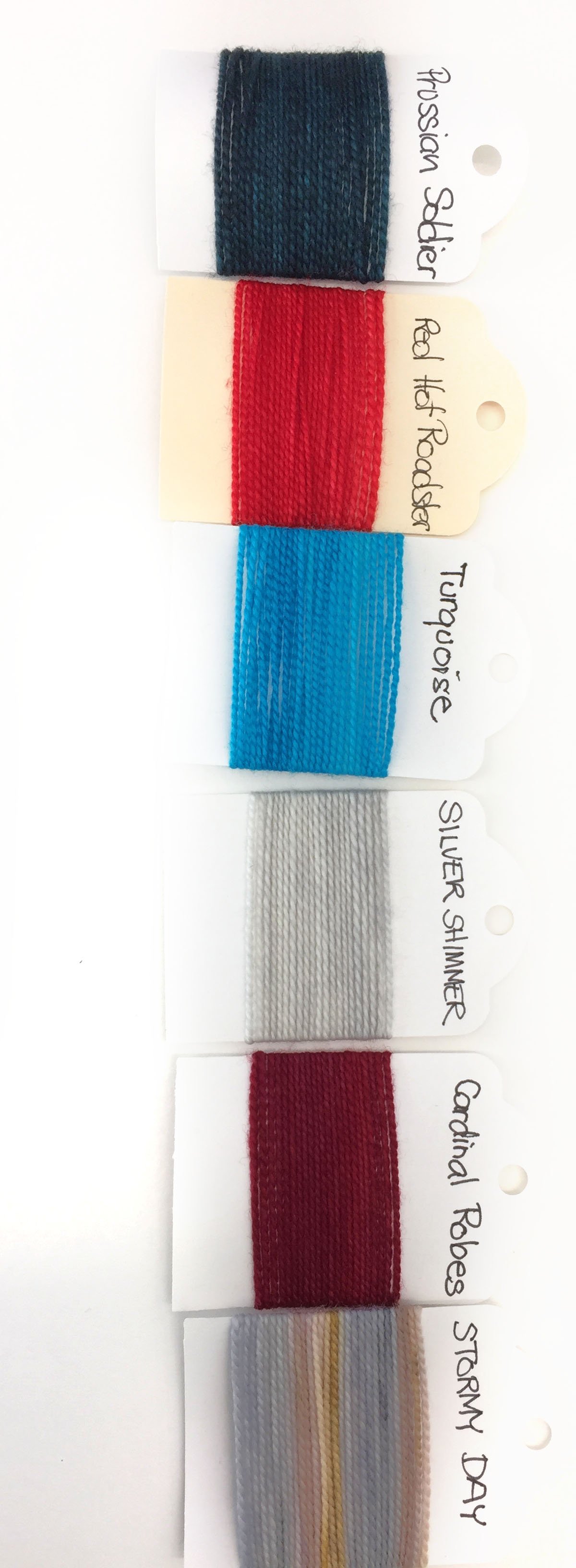
So many photos to look at and pull out colours! I started making groupings of potential colour way palettes with shade cards I made of my collection of Claudia Hand Painted Fingering Addiction and paper collages from printed copies of my photos and magazine clippings I brought back with me. I usually pull skeins of yarn when I'm in a shop to start creating an arranging a palette sometimes with a photo but usually I just start with colours I'm drawn to. The process of using the shade cards was an improved method over my previous skein pulling method as I could see, particularly with variegated yarns, how the color would look in bands. It is also a lot easier to move and shuffle shade cards than a lot of skeins of yarn! The paper collage method was interesting and surprisingly addicting! It was fun to cut and collage pieces and different colours together. What was really helpful was being able to play with proportion of colour. By trimming strips wider or narrower, I could play with adding a sliver of pop of colour that could be the contrast pattern yarn used for a few rows when knitting. I also tried to create gradients/ ombres with my paper photo collages which allowed me to play with how width each of my colour band. It will be interesting trying to match the colour palettes I created with my collages to actual shade cards- but I'm excited for that challenge and it's a more focused way of going about purchasing yarn!